
Aksarben village refresh
In 2024 I got the chance to work with Noddle and help them make a brand refresh. I was given the opportunity to make two different ideas and expand on them. The two different designs were named The Diamond logo and the N logo.
Logo Designs
-
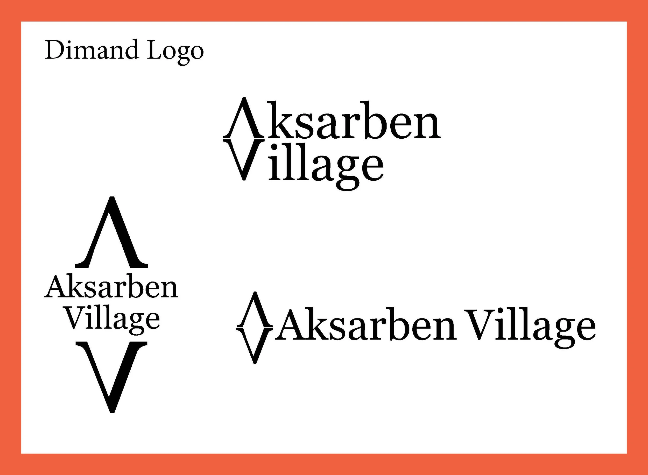
Aksarben Village Diamond Logo
This logo originated from a sketch based on several concepts in which the A and V were stacked. The result is a versatile mark that supports broad color customization and adapts easily to virtually any product or design.
-

Aksarben Village N Logo
This design re-imagines the letter N by dividing into the letters A and V while keeping its decorative shape. A nod to Aksarben, the reverse spelling of ‘Nebraska.’ It also take inspiration from sports team logos specifically high school and college football.
applications
The Diamond logo can be used as a pattern following the brands colors or as a rainbow. As the N logo gives the air of professionalism.
Icons
These icons are inspired by Aksarben’s major attractions and are intended to help visitors identify and navigate to key destinations quickly through maps and way finding systems